
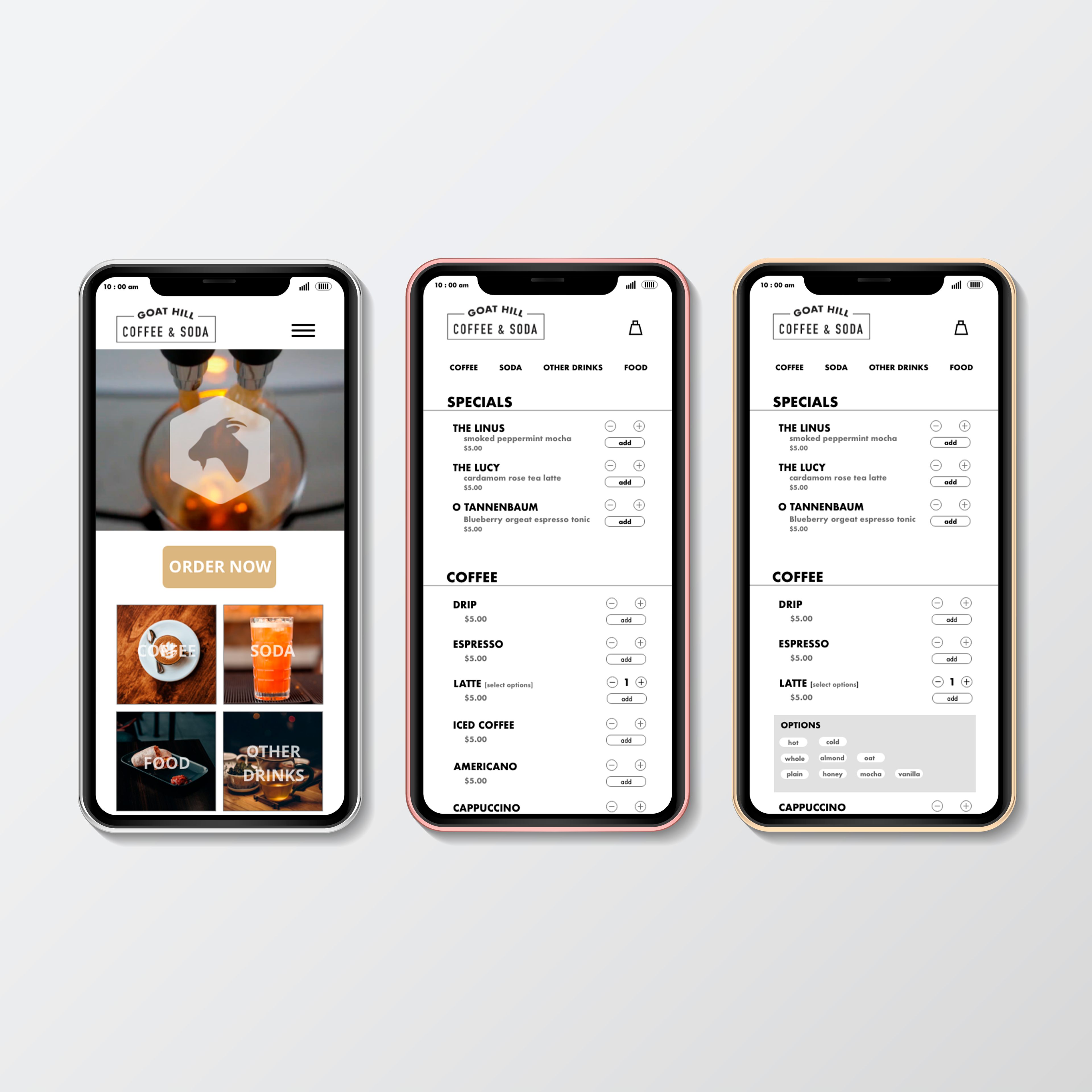
Minimal, and compact describe the brand's overall aesthetic utilizing the shop only most prominent feature - a large letterboard I reimagined the shops digital and physical menu.
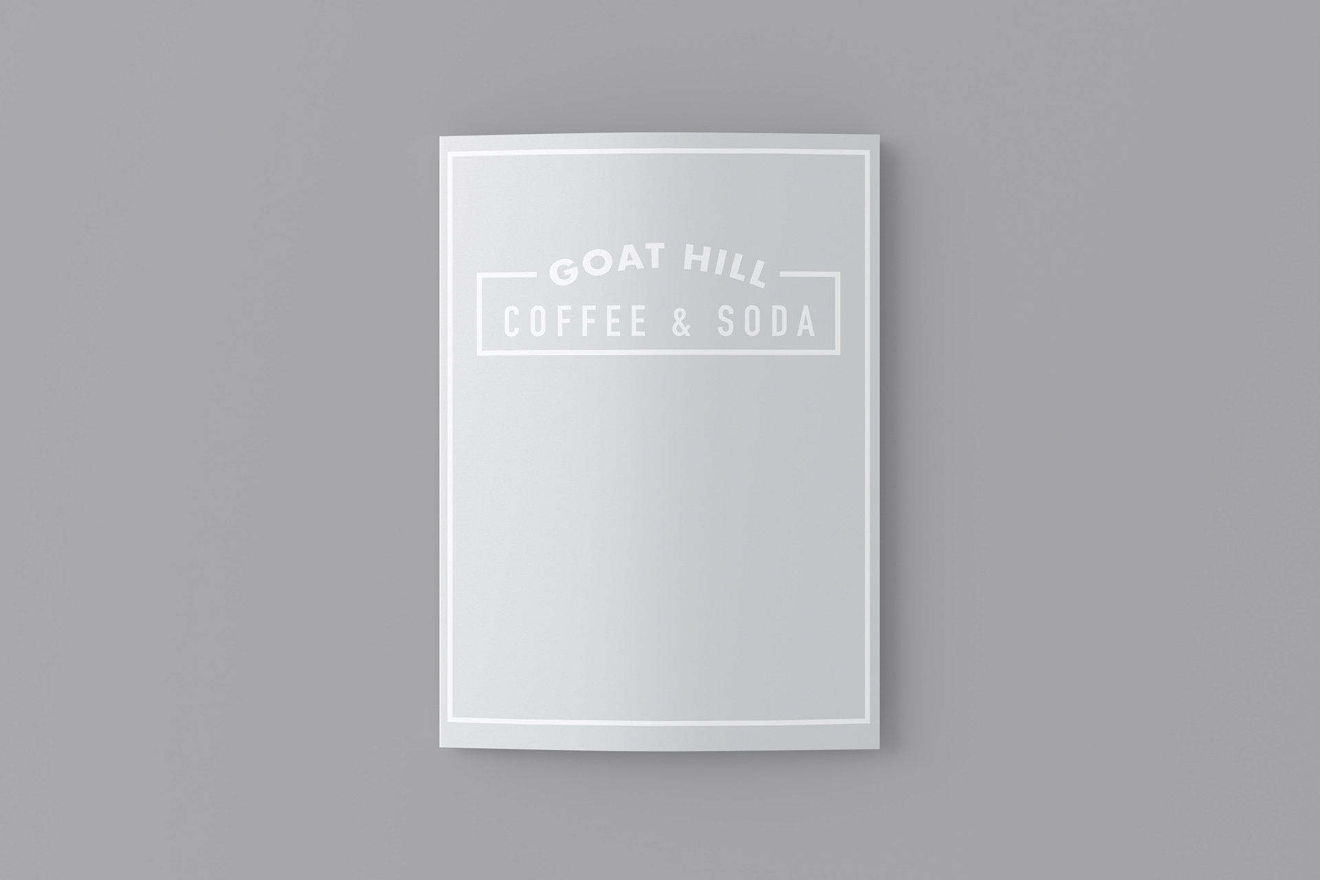
Scale and Color - The menu measures 4x6 inches when completely folded and features a limited color palette consisting of white, grey, and black to match the brand's existing aesthetic.
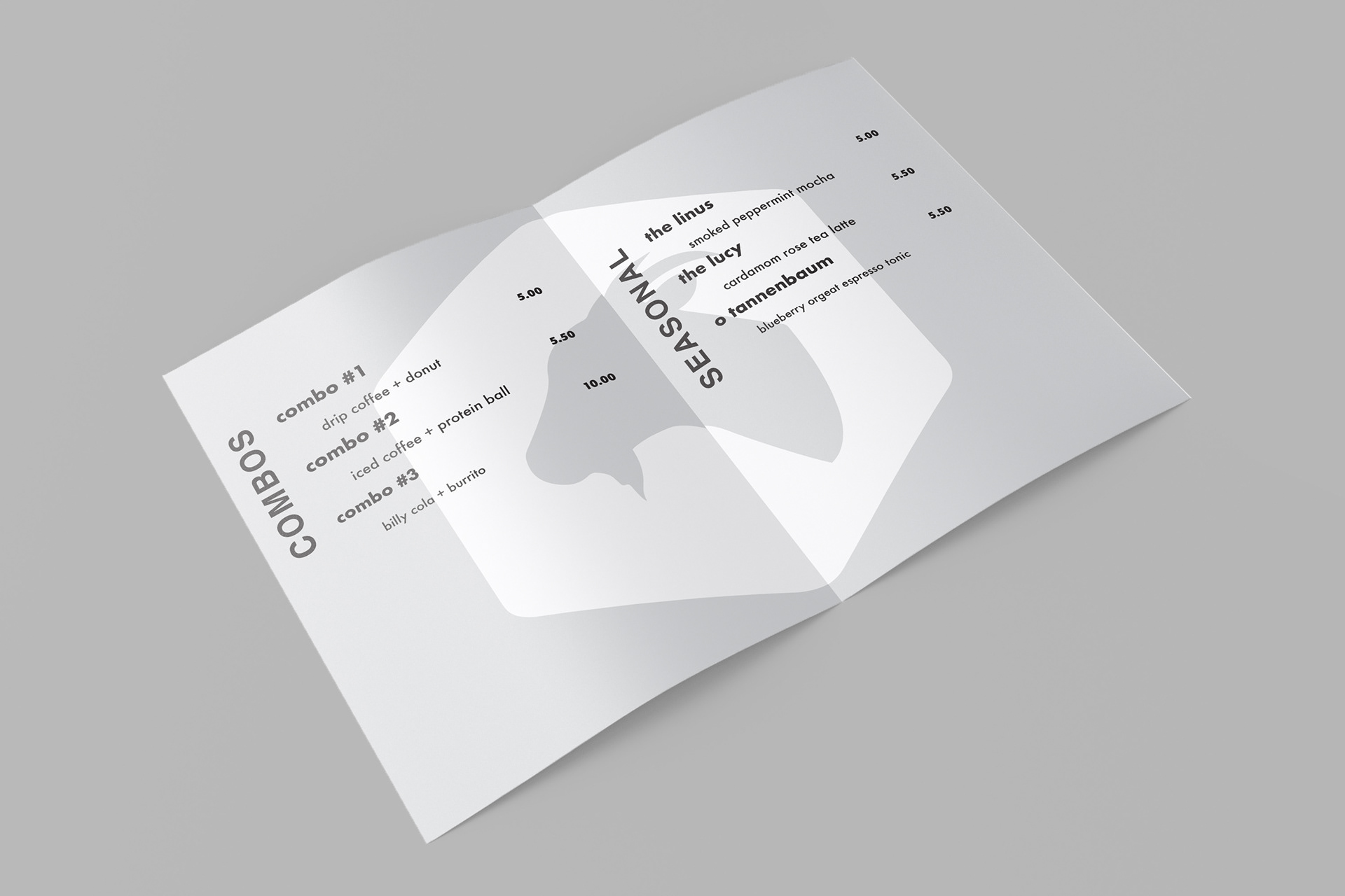
Double Gate Fold - The menu is printed on a practical yet interesting double-gatefold brochure highlighting the brand's signature goat head upon initial opening.

Letterboard Menu - The shop's signature letterboard menu is reimagined.
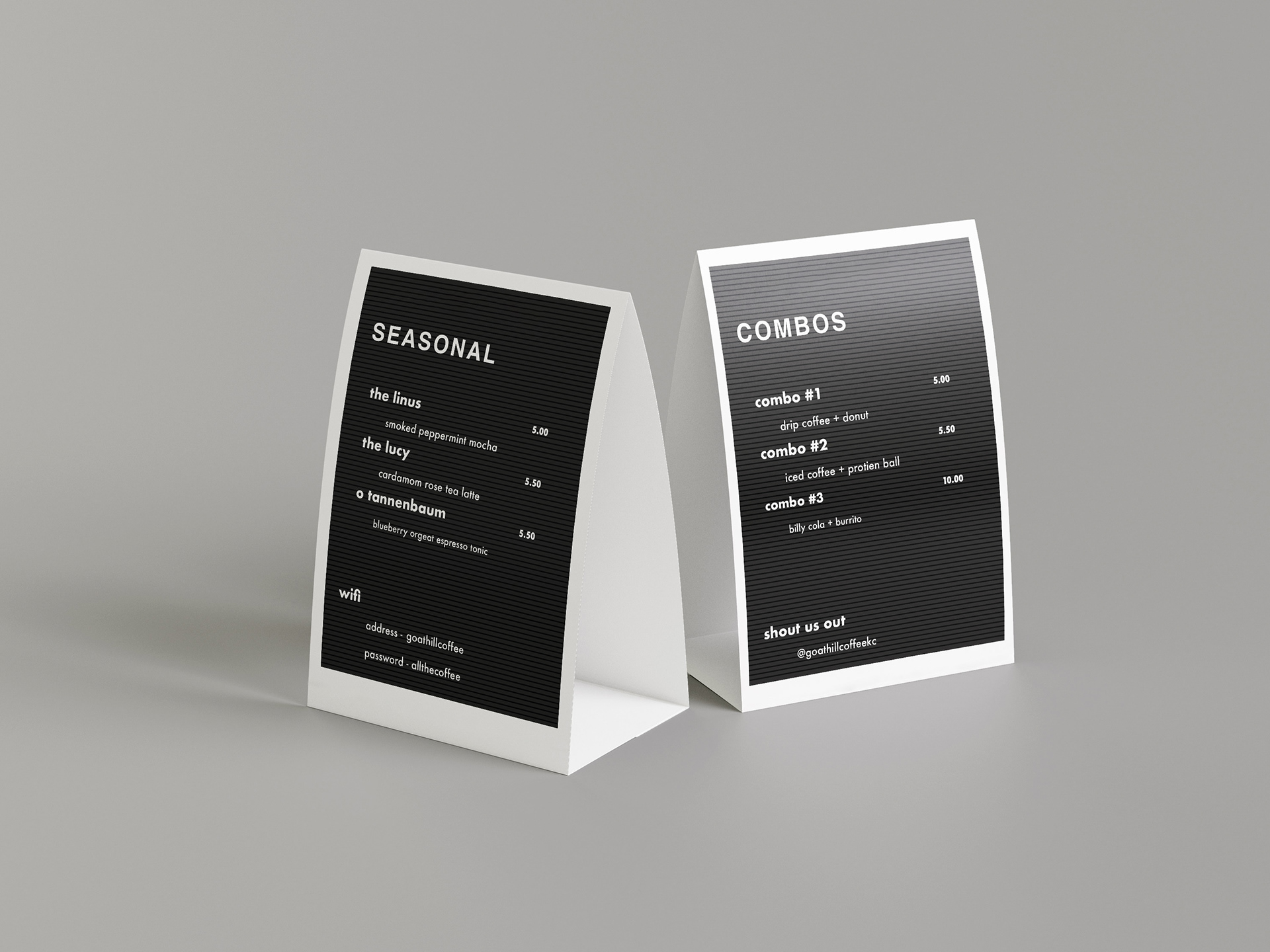
Table Tents - Inspired by the letterboard design.

Punch Card - Minimalistic punch card design featuring signature goat head.